本文是由杭州專賣店設計公司轉發英國設計周新聞資訊,因杭州專賣店設計公司小編不會英文,所以文章用翻譯軟件直譯:
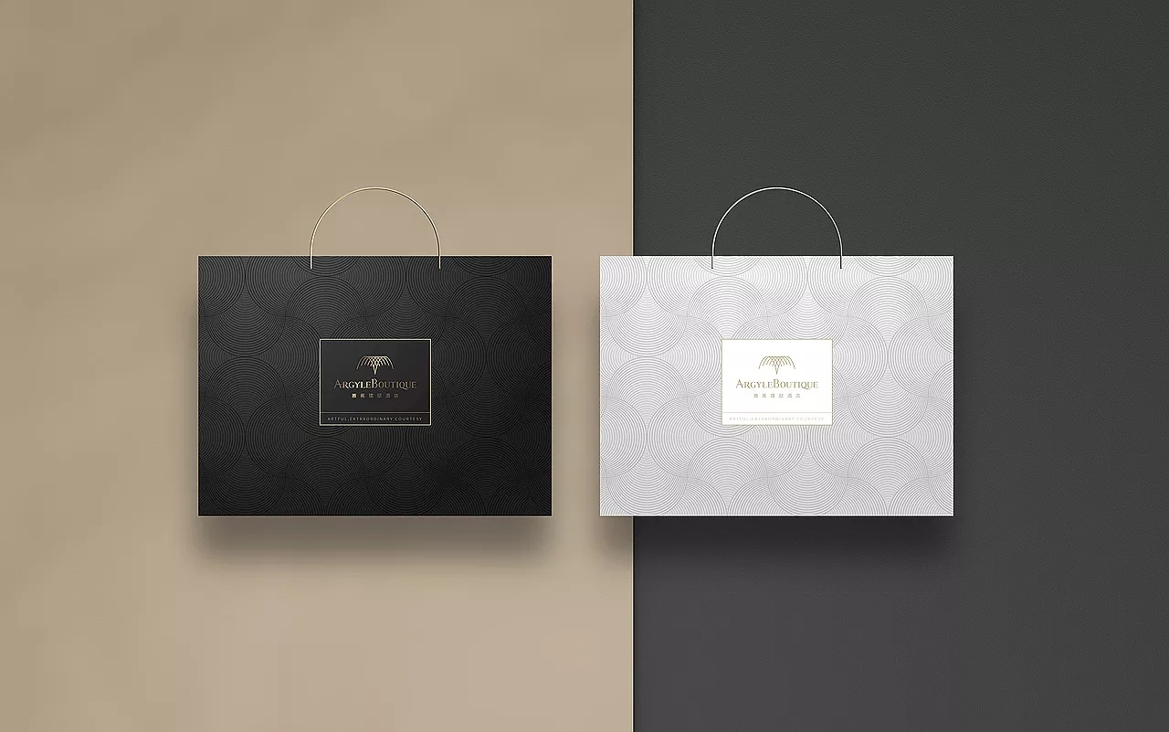 注:配圖為本公司作品
Design studio Collins has rebranded Match, positioning the dating platform as a “beloved service rather than a convenient game”.
The new identity, which includes a redesigned logo, strategy and photography guidelines, is revealed in time for the company’s 25th anniversary.
Since Match’s founding in 1995, “dating has become a panic-induced, anxiety-ridden journey”, Collins says. “Match was sitting on a treasure trove of experience and knowledge gained over 25 years, ready to be reassembled and reorganized for a new future.”
The new identity needed to update these lessons while also bringing “trust and experience back to the forefront”, the studio adds.
Another ambition for the new look was to create a “more inclusive” environment which could also be “intimate and inviting” for the app’s users, Collins says.
In the redesigned wordmark, the heart icon has moved from the top to bottom and become a full stop. This “indicates the confidence in service that Match represents”, Collins says. The “m” and heart-shape pair can be also configured separately, as an icon on the app for example.
Type foundry Displaay’s Reckless as been chosen as the primary typeface, along with Beausite from Fatype . A more muted colour palette is in use, doing away with “glaring, bright colours” and opting for more “tonal and inviting” shades, according to Collins.
This is accompanied by romantic lifestyle photography, which includes pairs of hands, silk blankets as well as lit candles.
These visual cues were inspired by two concepts – hospitality and concierge – which is an attempt to differentiate Match from its rivals, according to Collins.
“Where other apps forcibly push you to ‘engage and maximise your limits, Match strives for the effortlessness of a concierge’s wave, showing you to your table; almost invisible but deeply appreciated,” the studio says.
A new strategy has launched across the company’s product, marketing and design teams which emphasises the “time and intention” behind using Match, according to Collins.
Match profiles require users to add information about themselves including hobbies like hiking and travelling as well as relationship-oriented activities like cooking together.
“It doesn’t take minutes to create a profile; it takes time and intention,” Collins says. “Dating, then, is not an end. It’s the means.”
This has influenced a number of new features on the app, from iconography to language to the use of dating experts, the studio adds. This hopes to encourage users to be “more open to the myriad possibilities” of getting to know someone.
According to Collins, the new identity was tested in a beta version with customers and showed a 13% increase in use across key metrics.
What do you think of Match’s rebrand? Let us know in the comments below.
業務咨詢 付小姐

業務咨詢 舒先生
總監微信咨詢 付小姐